Evolution of a calendar
The steps taken to improve the calendar for APPoint.

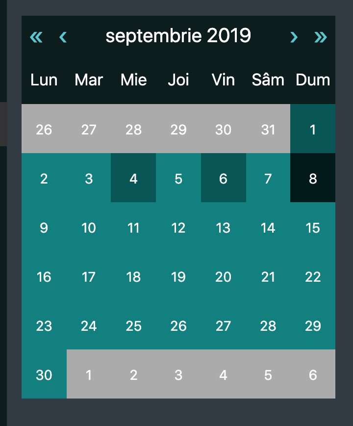
We started with a basic looking calendar, thst only highlighted the days when you had appointments, not much else. It also looked like 1999. We had to do better and bring more value to the user.
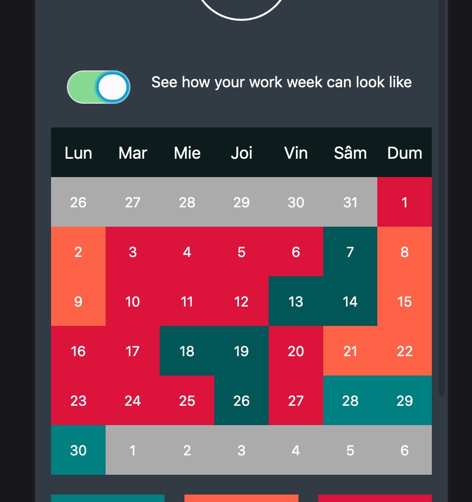
First thing we did was color code the days. A lot of appointments turn the day red. Already it's more useful and you get an overview of how busy your month is. We can improve still.
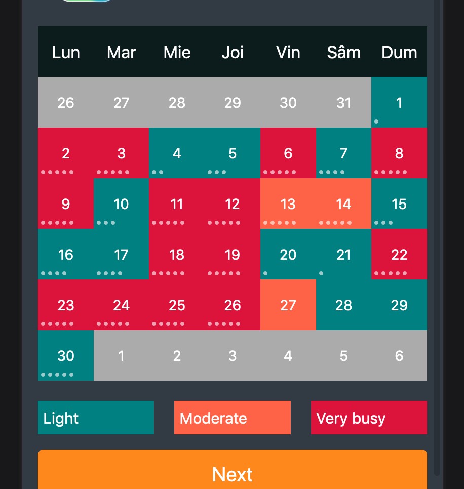
We added dots to show you just how many appointments you have on that day. 3 long or 7 shorter. Your workload is even clearer. Still not very pretty though...
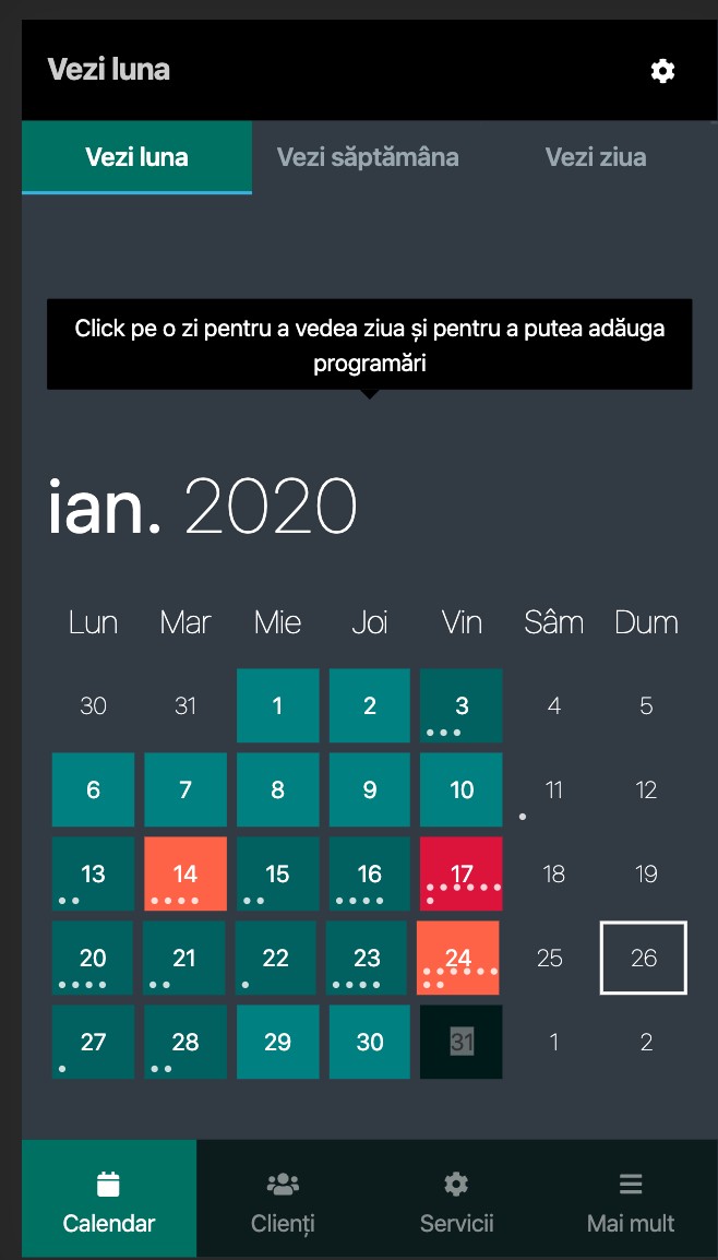
The final design. Some spacing added, different fonts, removed some backgrounds and it looks like a different thing. Also added swipe support to change the months easily.